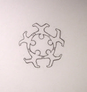
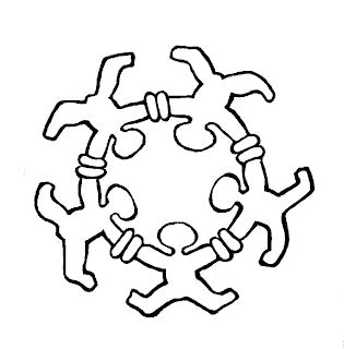
When I mentioned my recent concentration with pencil drawings to my brother Jon, he hinted toward wanting help with the logo he’s been using for his blog. It originated from a tattoo he has on his ankle & the photo is thus distorted. I’ve long known that I can ride the horse of energies to tackle similar projects, so a re-working of the image his tattoo artist made came rather quickly.
I have numerous layers in my historical dance as a graphic artist, from high school & college posters to my own logo, which has remained a constant all my life. My business cards were re-calligraphed for each of my points of perigrination, I drew theater bills & logos for other businesses during my Sedona years. I had an alter ego named Leo Toye… but all that is quite a different story.
BroJon tells his own about how he came to wear the notion of SOMOS UNOS here…
The image needed to become more clear & I love working with the rhythms of hand inked line widths to imply lively space. The idea of being one vibrates life in more than cookie cutter sameness, so I played with gesture & suggested subtle anatomy. I emphasized the circling hands with stronger connection, more like a big kiss between us all, however it also glyphs magnetism & suction. Holding the differences of circle.
My experiments with color were more of the education I need in the realm of Photoshop. He dialogued a clearer version…
Now he has colored it yet differently & to great effect, as seen on his site.
I will post other drawings soon. It feels good to be playing so deeply!


